BRAND DESIGN
HiBob Brand Evolution
The authorship of this project is a collaboration between the entire brand and marketing design group team at HiBob: Adi Elias, Itamar Sagee, Orna Reitshtein, Aviv Braunstein, Jaime Pinho and myself. Led by Itai Lahav, our former Creative Director.
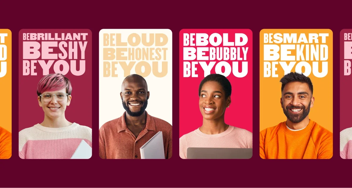
HiBob, an HR platform founded in 2015, evolved its brand identity to better reflect its growth and people-first philosophy. The project focused on redesigning the company logo and refreshing the broader visual system while maintaining the brand’s friendly and approachable personality.
The previous logo created confusion around the company name (“Bob” vs. “HiBob”) and lacked flexibility across digital and physical touchpoints. The new design clarifies the brand name while introducing a more functional, adaptable, and playful identity.
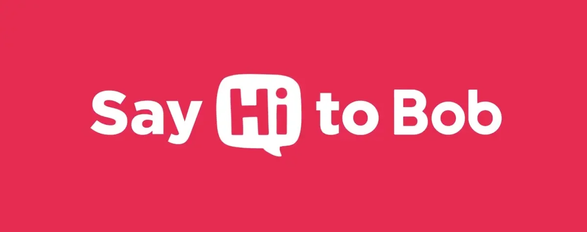
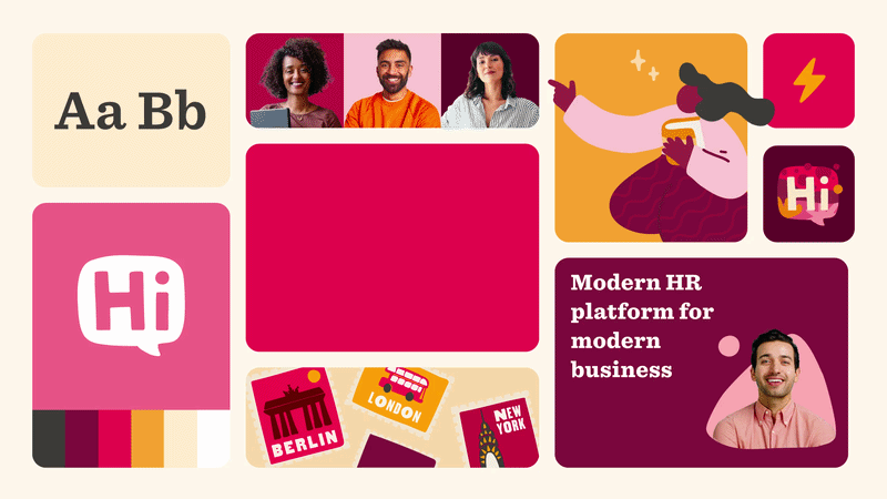
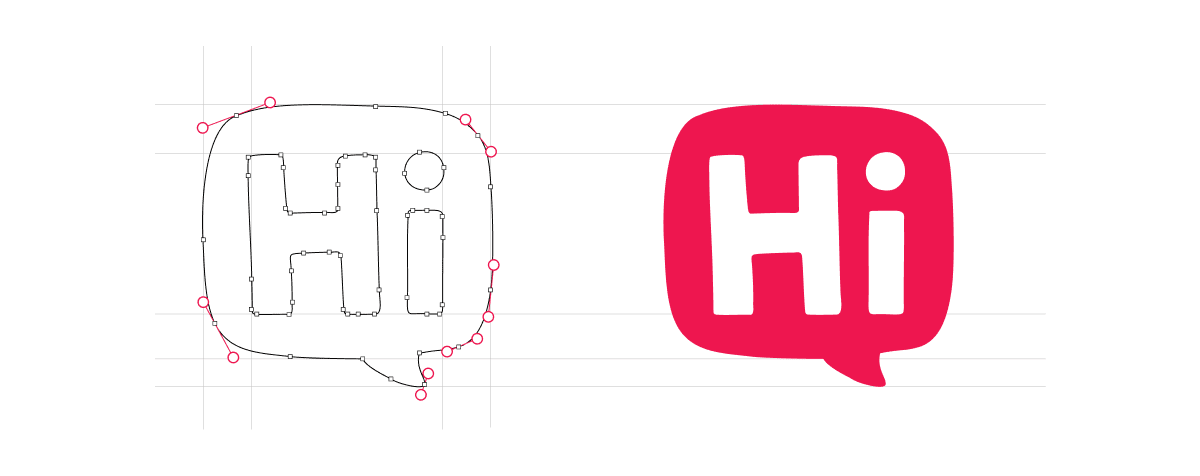
The refreshed logo emphasizes three key principles: functionality, flexibility, and fun. A speech-bubble motif and handwritten “Hi” reinforce the brand’s conversational and human tone, while the updated typography improves clarity and scalability across different formats.
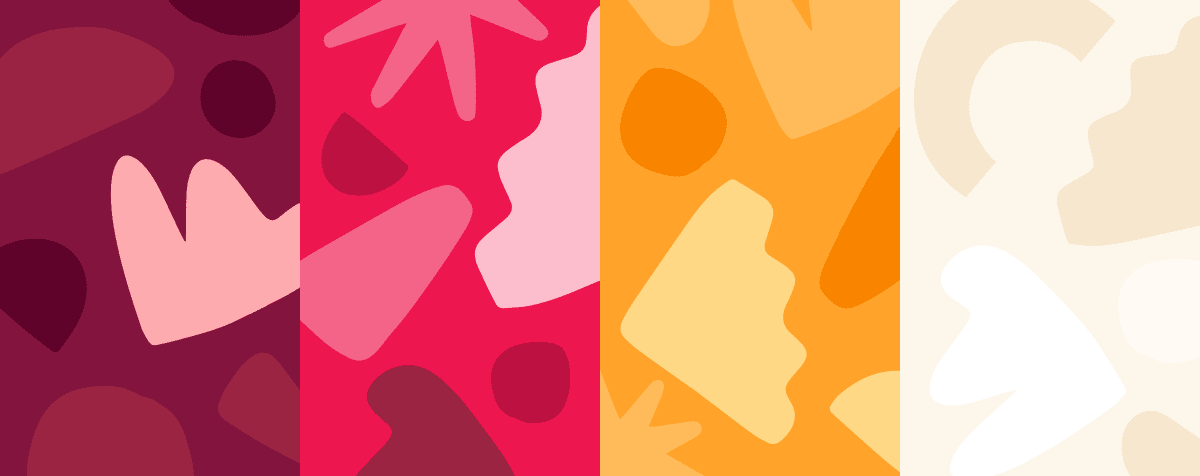
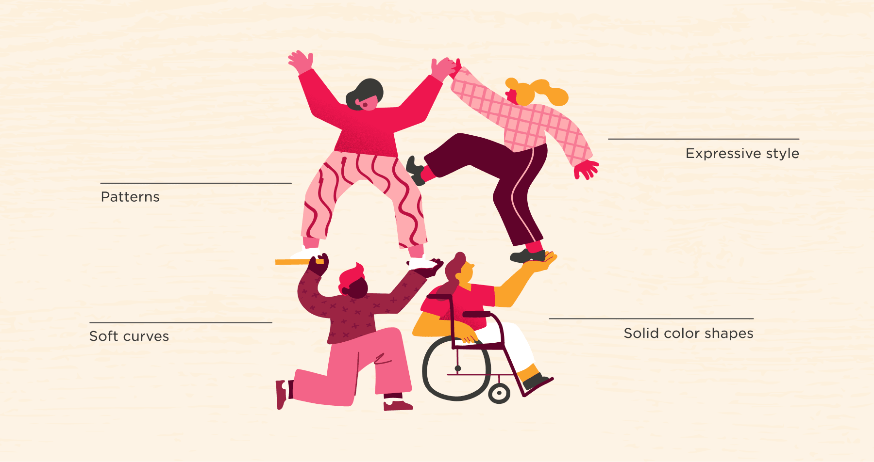
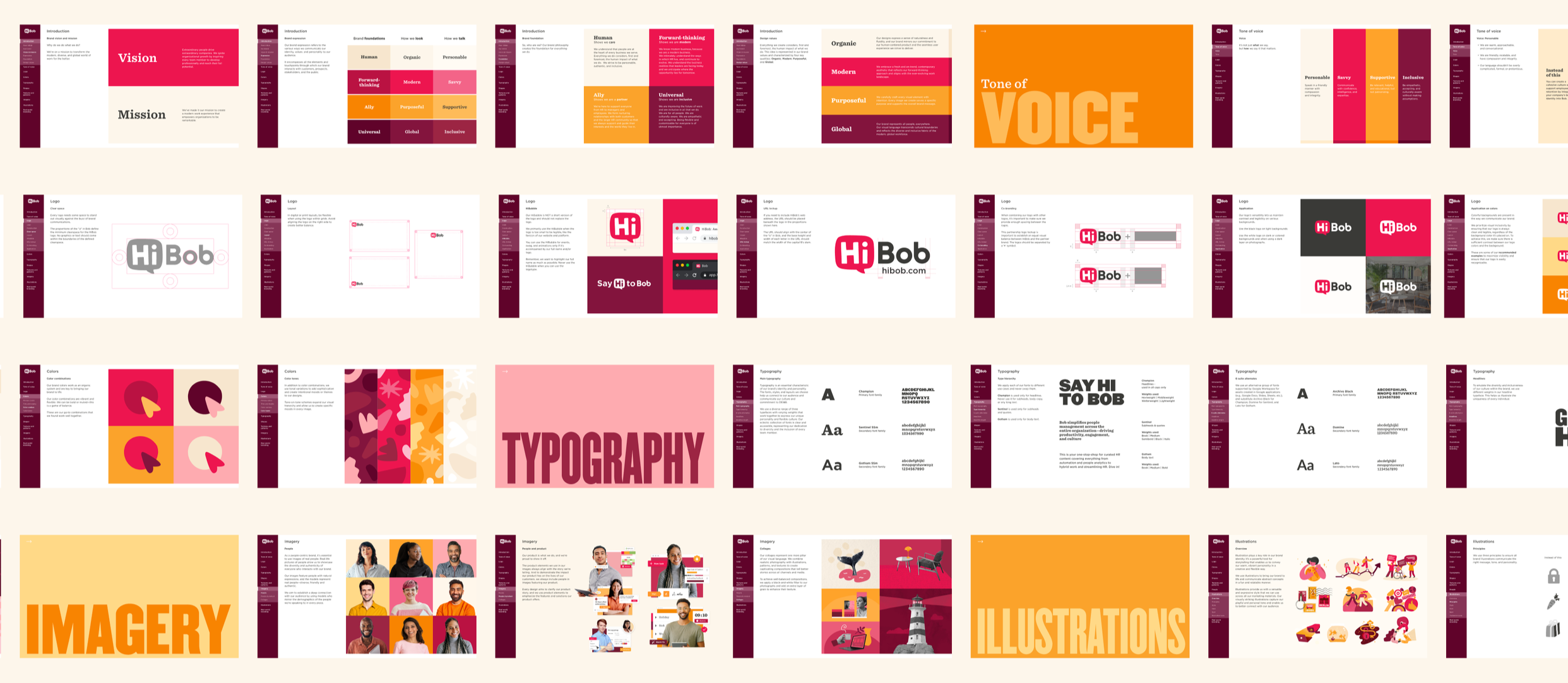
Beyond the logo, the redesign expanded the visual language, including a richer color palette, rounded shapes, expressive illustrations, and more inclusive photography. Together, these elements create a cohesive system that supports HiBob’s mission of building more human workplaces.